BODECKER CREATIVE FOUNDATION
Full Branding and Identity creation
I had the privilege of leading a significant project during my time at Nike SB, centered around the estate of the late Sandy Bodecker, the pioneering figure behind Nike SB. Situated in NW Portland, the estate comprises a splendid blend of living and working spaces, featuring amenities such as an in-ground skate pool and a state-of-the-art recording studio. Sandy Bodecker's profound legacy lives on through the establishment of a non-profit Creative Foundation for Portland Youth and resident artists, offering access to these remarkable facilities.
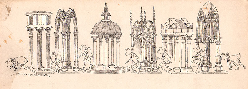
Inspired by the remarkable architecture and spatial design aimed at nurturing young artists, my initial vision was to spotlight the building itself in our branding efforts, anchoring the concept of a creative foundation within its physical space. However, the Bodecker family's artistic lineage extends beyond Sandy; his father, NM Bodecker, stands as a renowned illustrator celebrated for his work spanning the '60s through the '80s. This presented us with a rich reservoir of artwork to integrate into the brand identity, prompting deep explorations into historical narratives rather than focusing on the forward-looking ethos that the creative foundation represents.
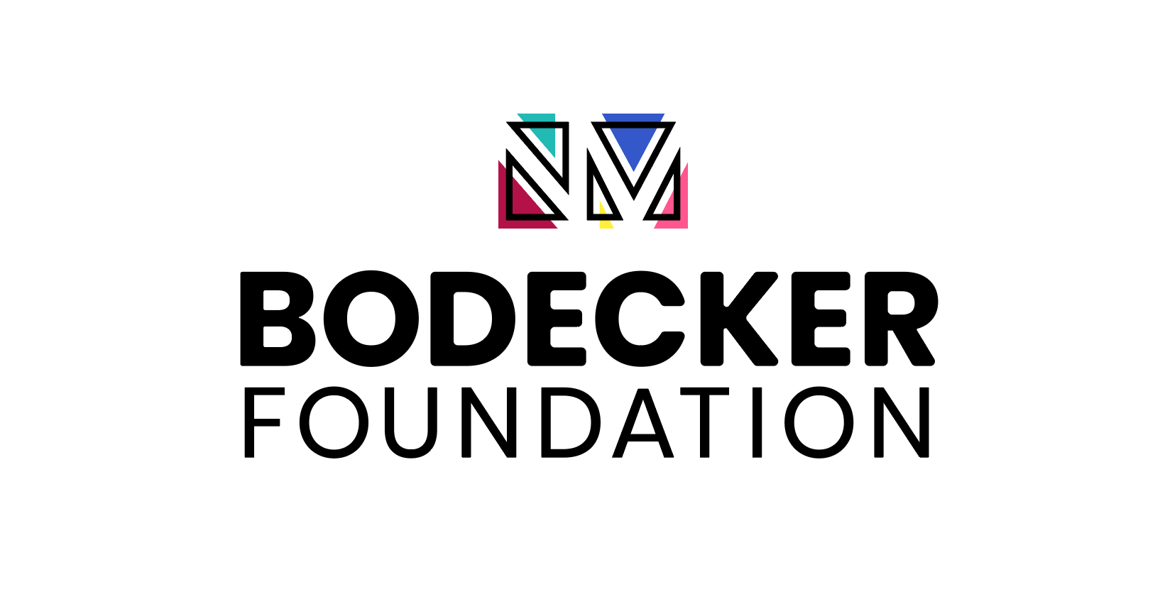
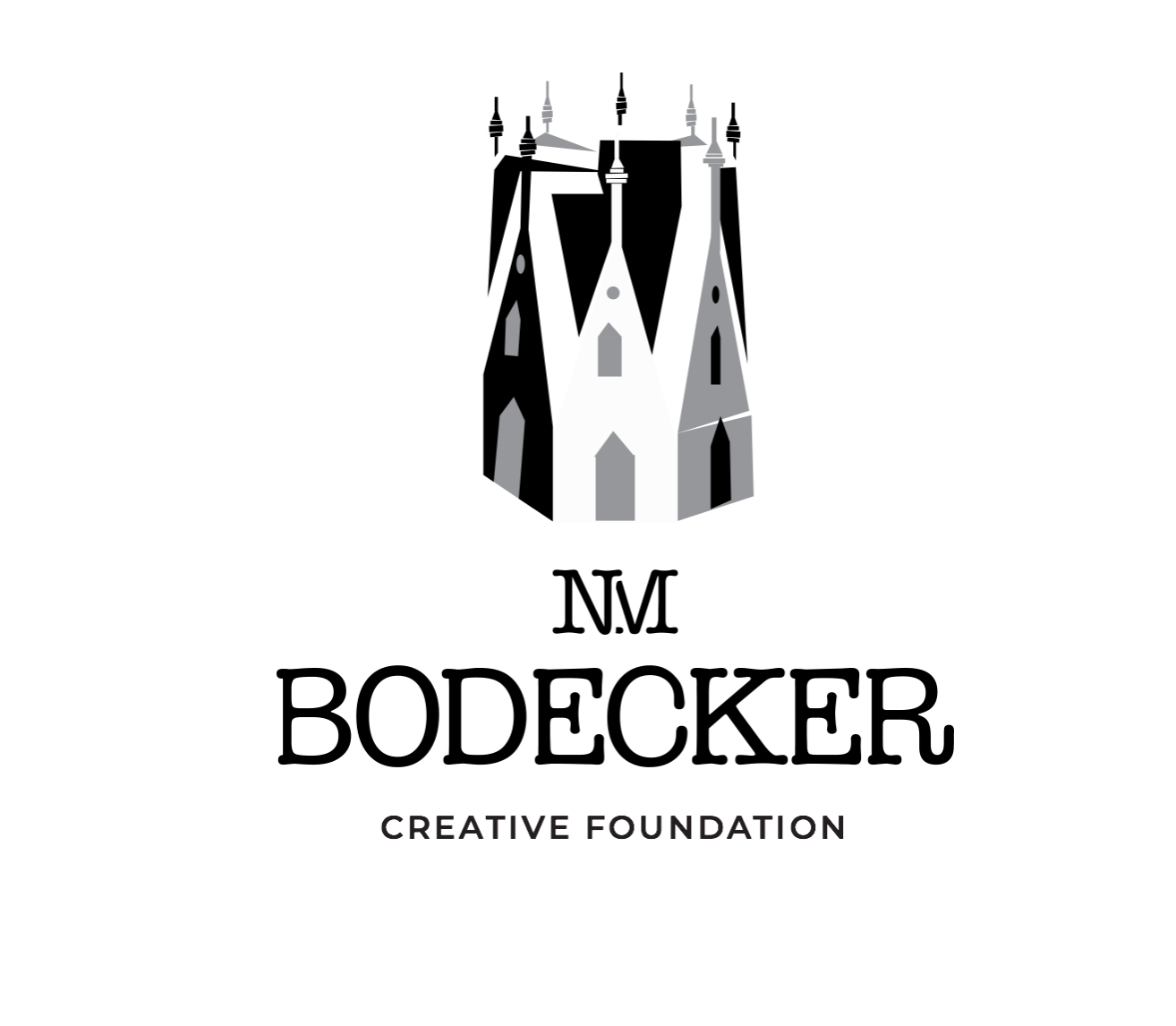
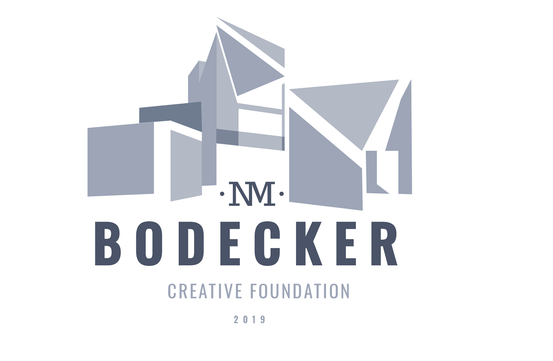
After several iterations and revisions, we arrived at a logo that resonated strongly with the foundation—a harmonious fusion of color (reflecting Sandy's legacy), architecture (symbolized by triangle blocks), and NM's artistic influence. The result is a modern branding solution that encapsulates the essence of the foundation's mission.

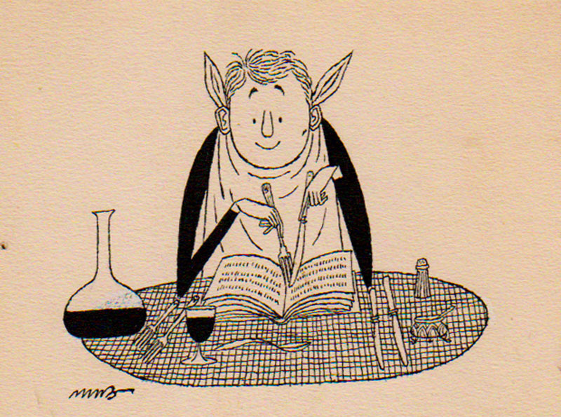
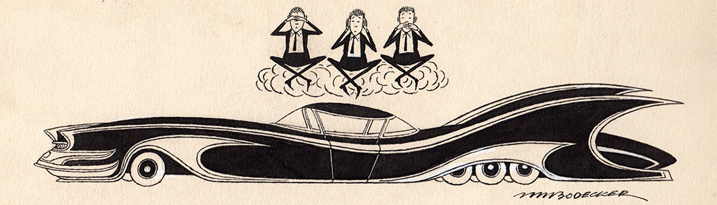
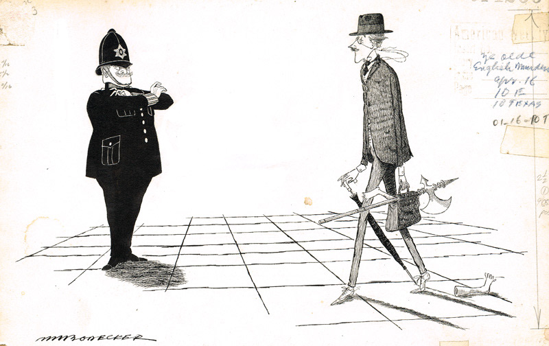
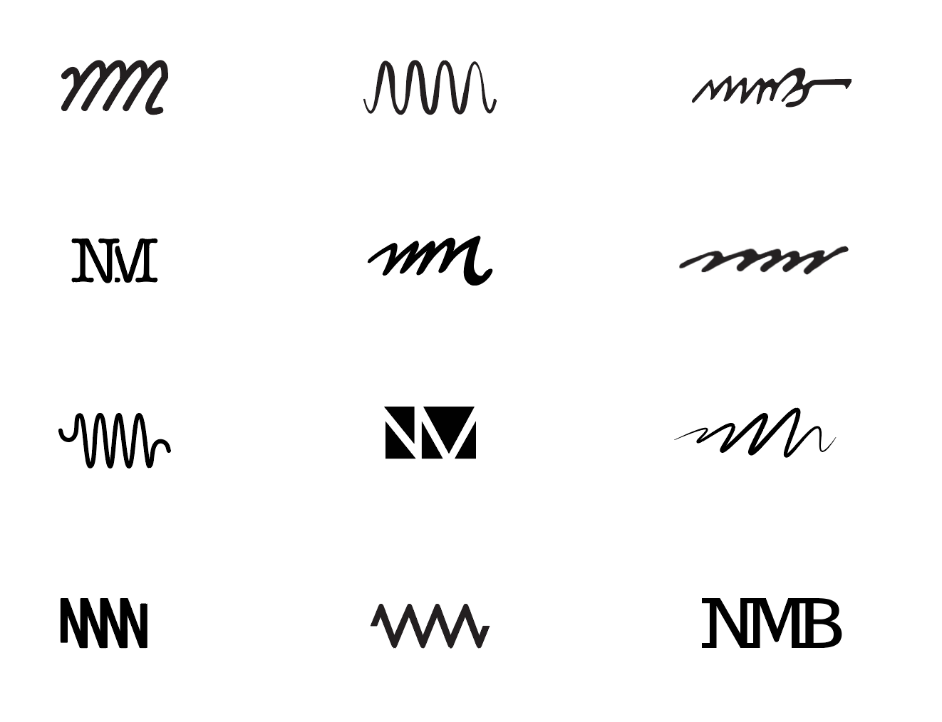
Work Flow and Process insights: Following illustrations are examples of NM Bodecker's work

Direction 1
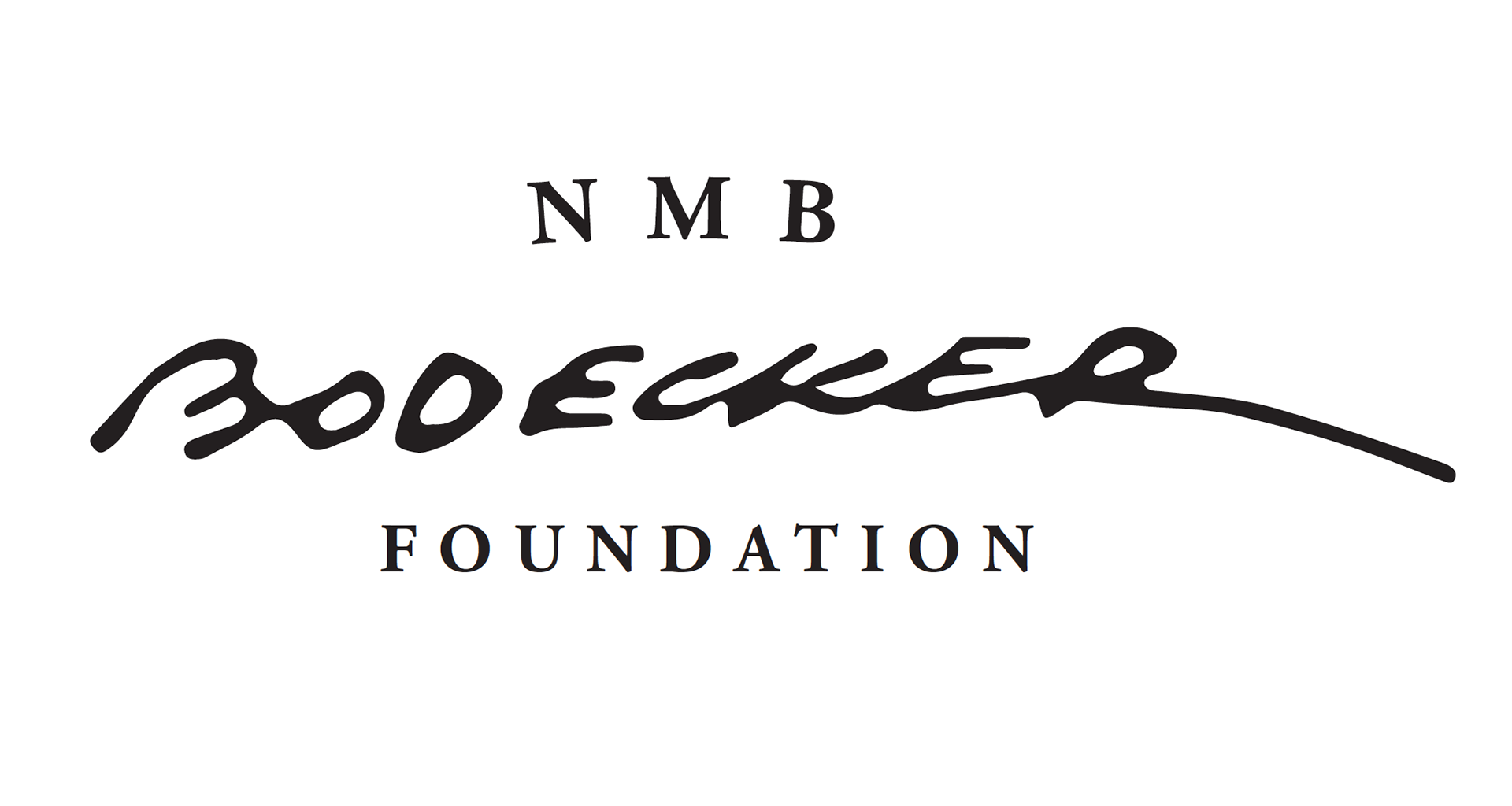
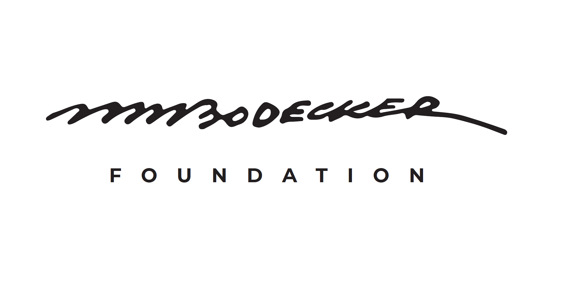
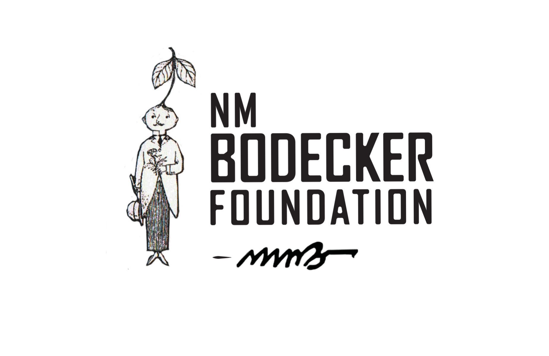
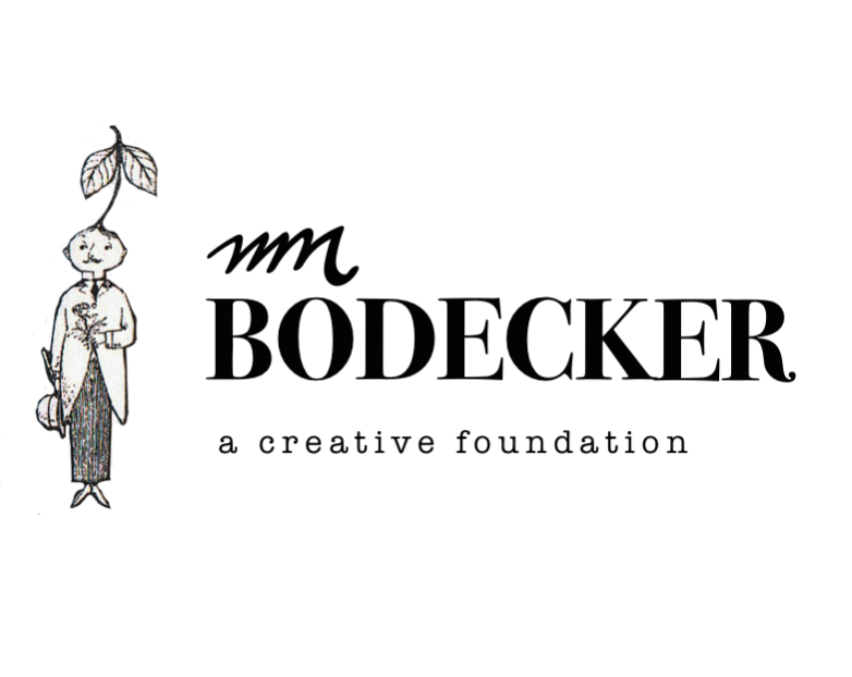
Create a mark based on the Signature of NM Bodecker honoring the father and his legacy while Sandy's lies in the structure of the foundation.
Monogram study
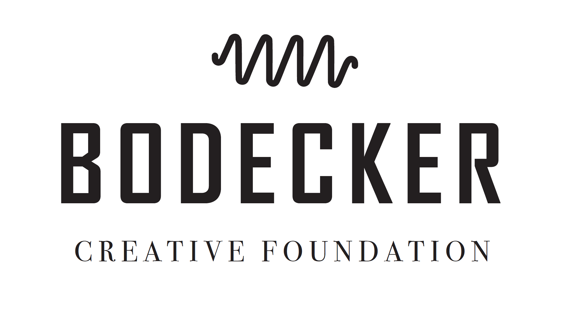
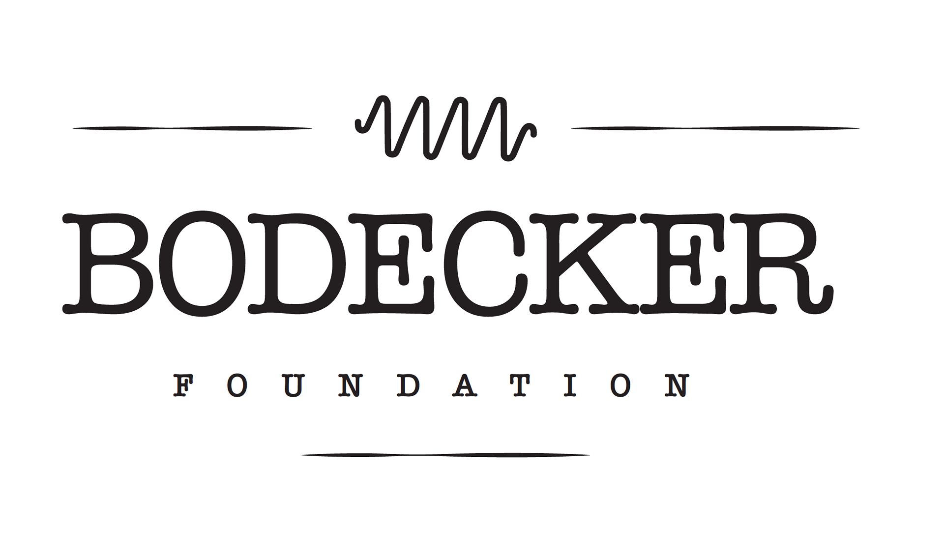
Alternate layouts and type

Direction 2
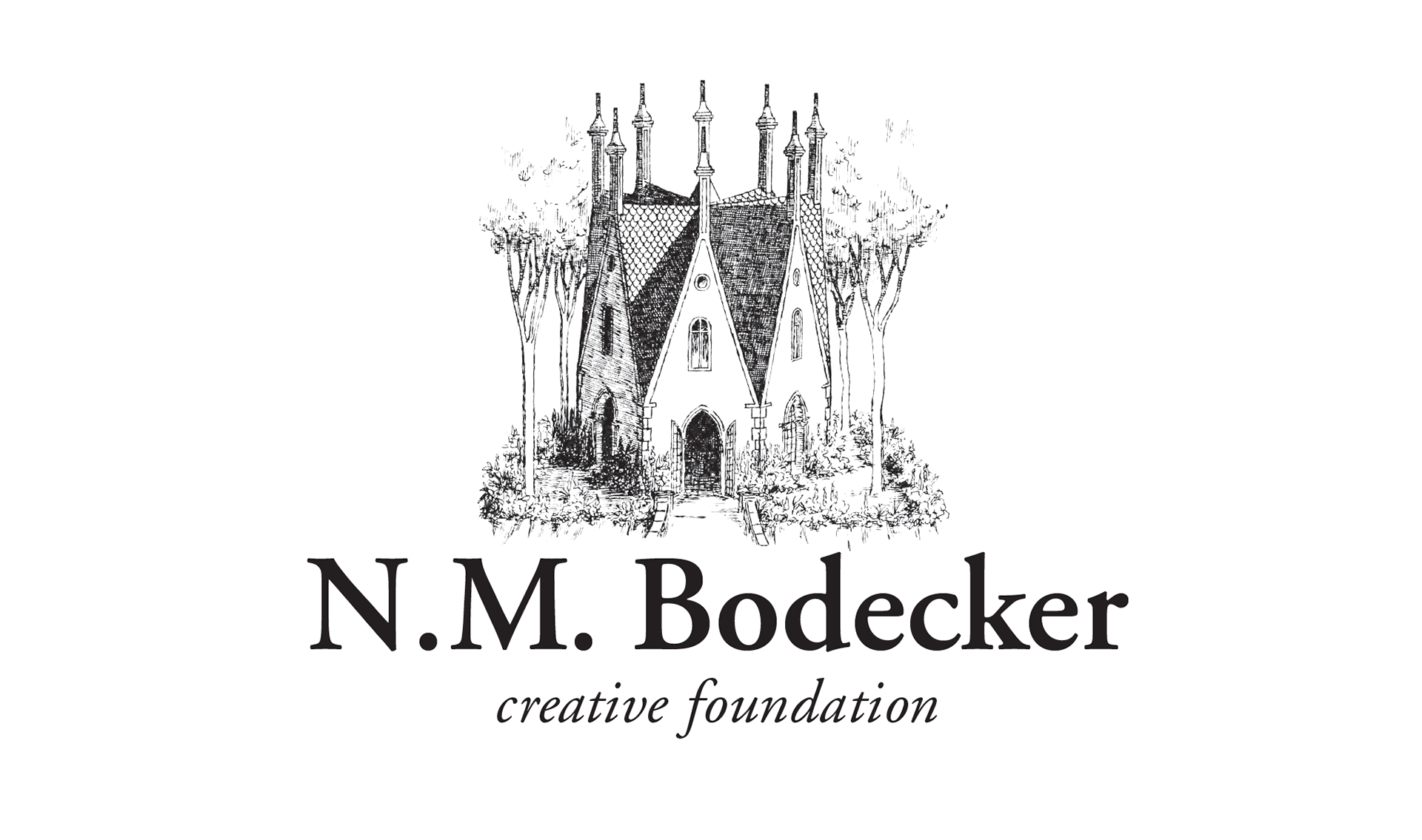
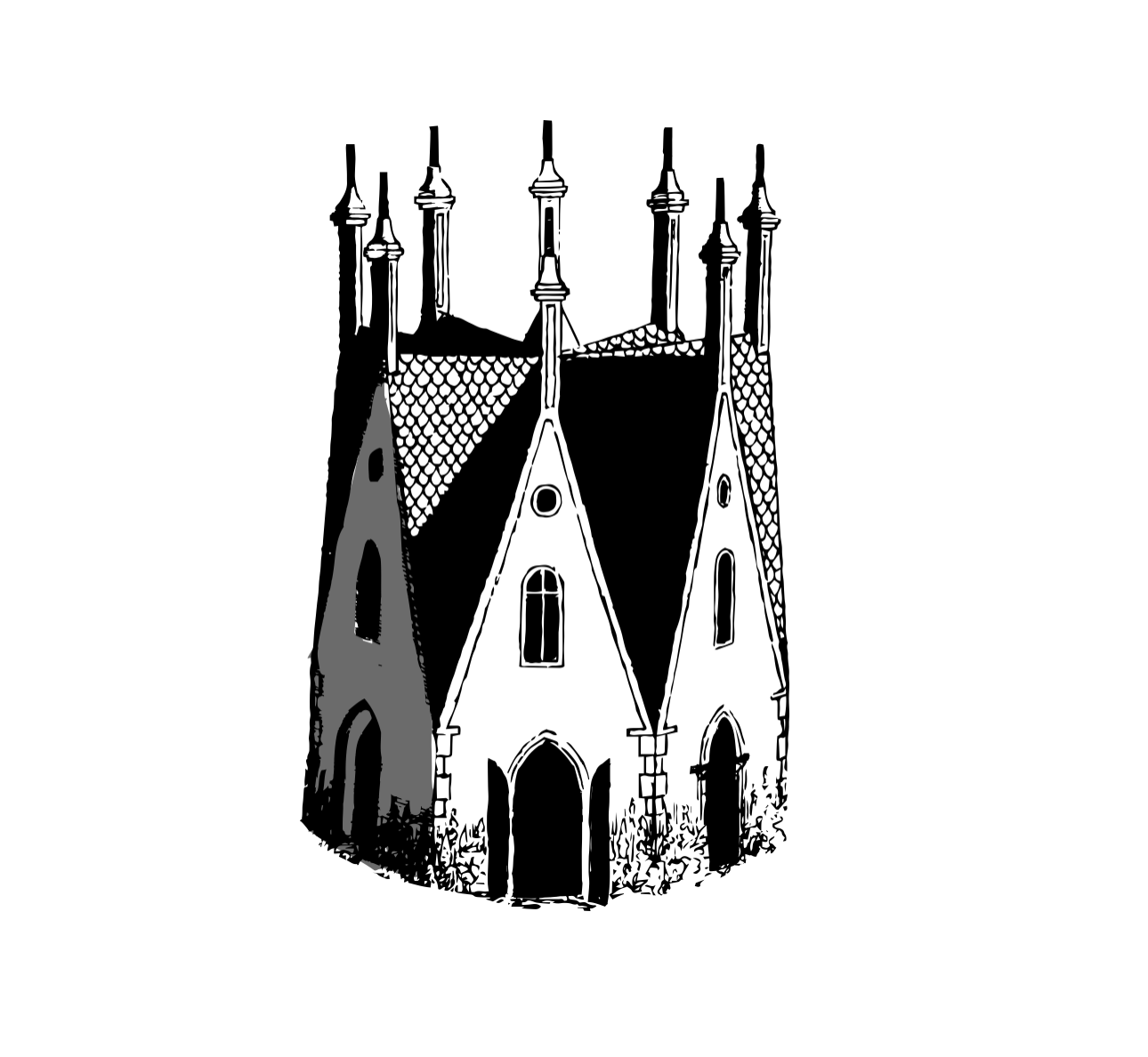
"The Eight-Sided House" was an NM illustration, and seemed appropriate for this setting. The idea was to take the illustrative style of the image and try and tweak it creatively to give it a more now vibe and less '70s fairytale.

Direction 3
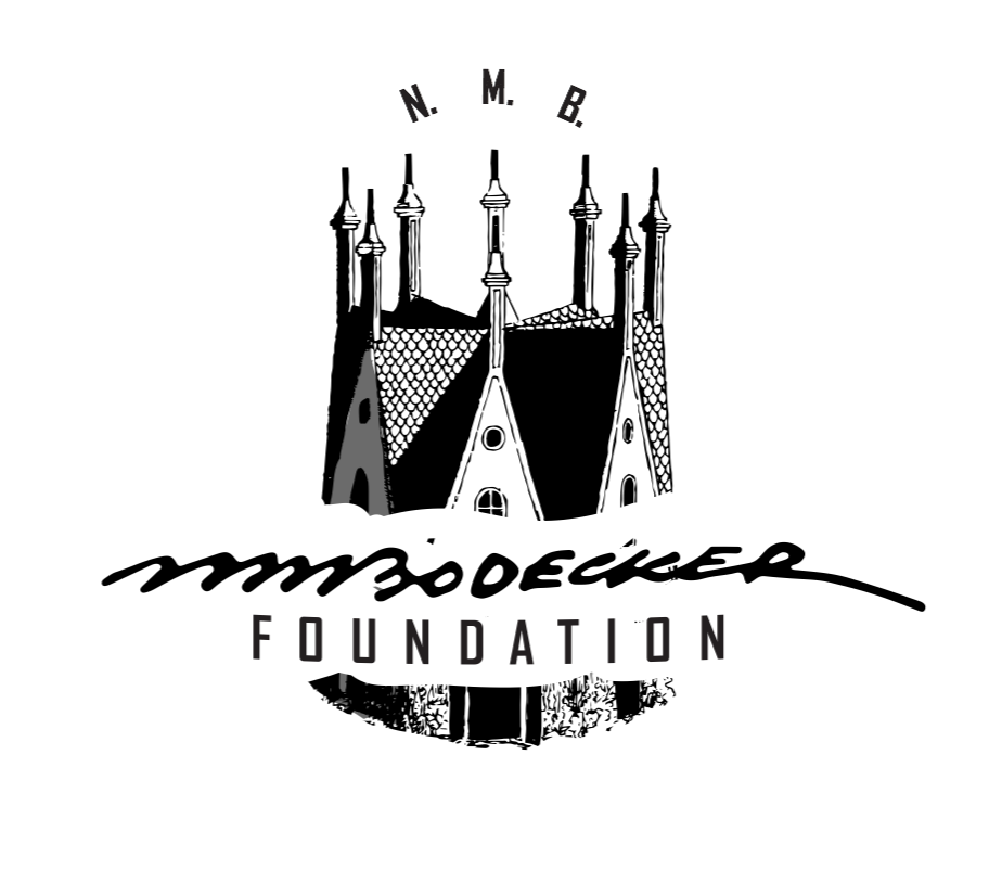
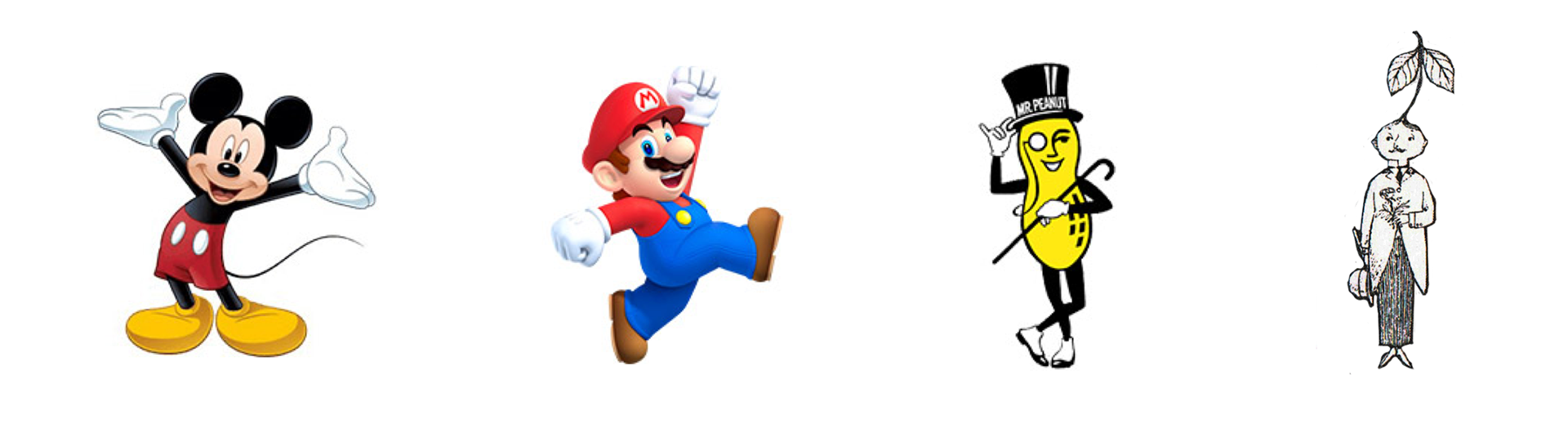
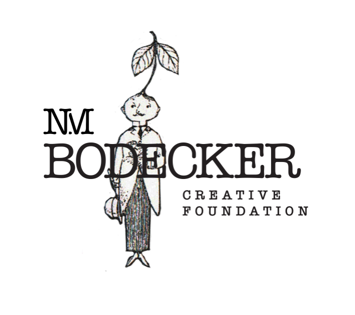
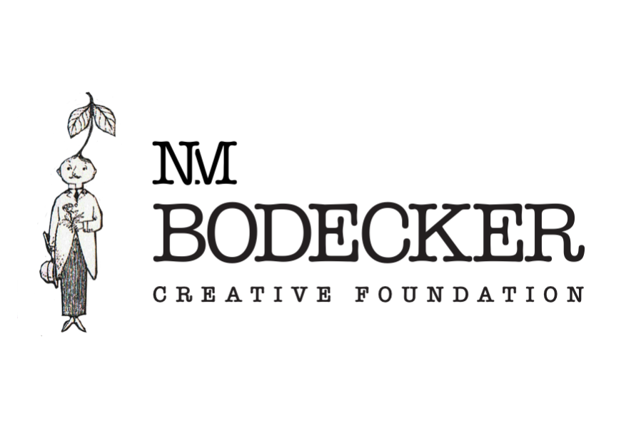
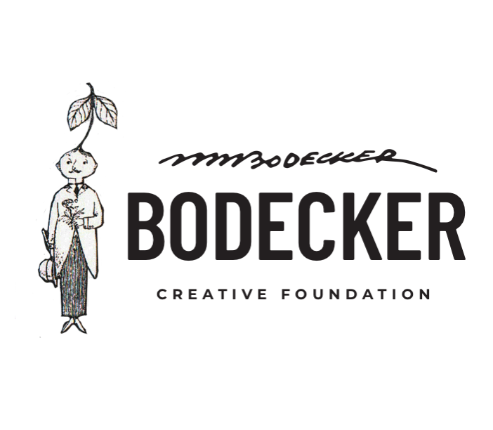
Make a mascot of a sketched self-portrait (pictured last) of NM Bodecker to accompany a word mark.

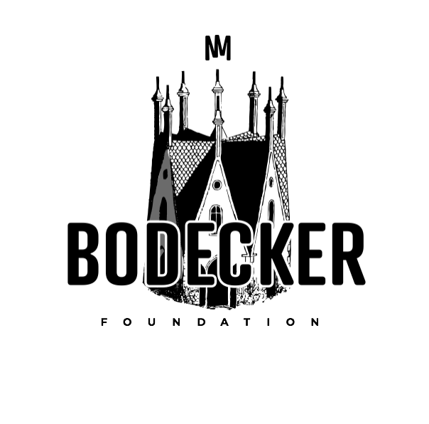
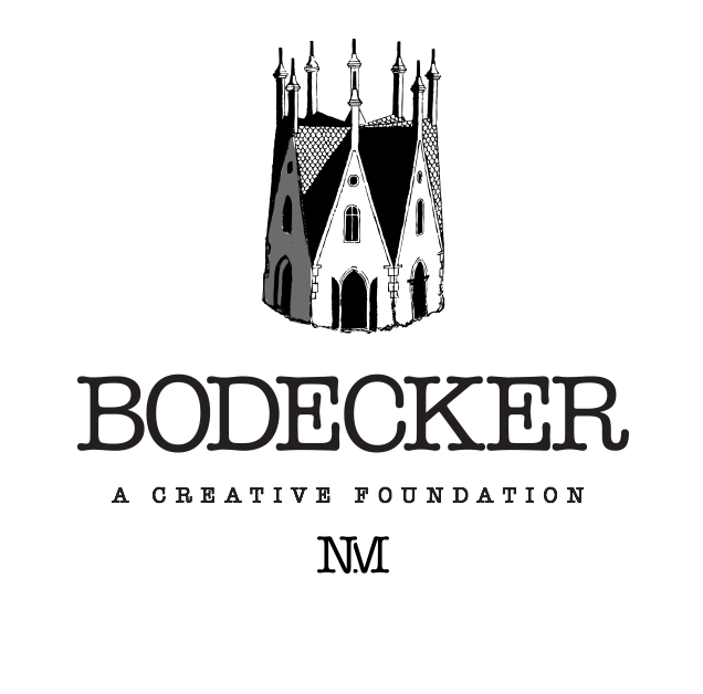
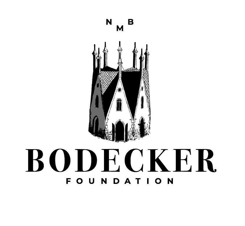
Direction 4
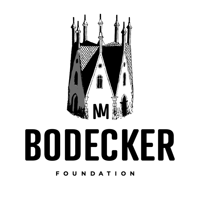
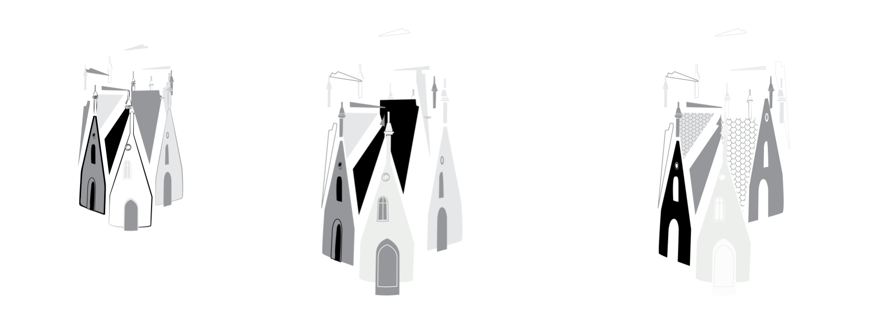
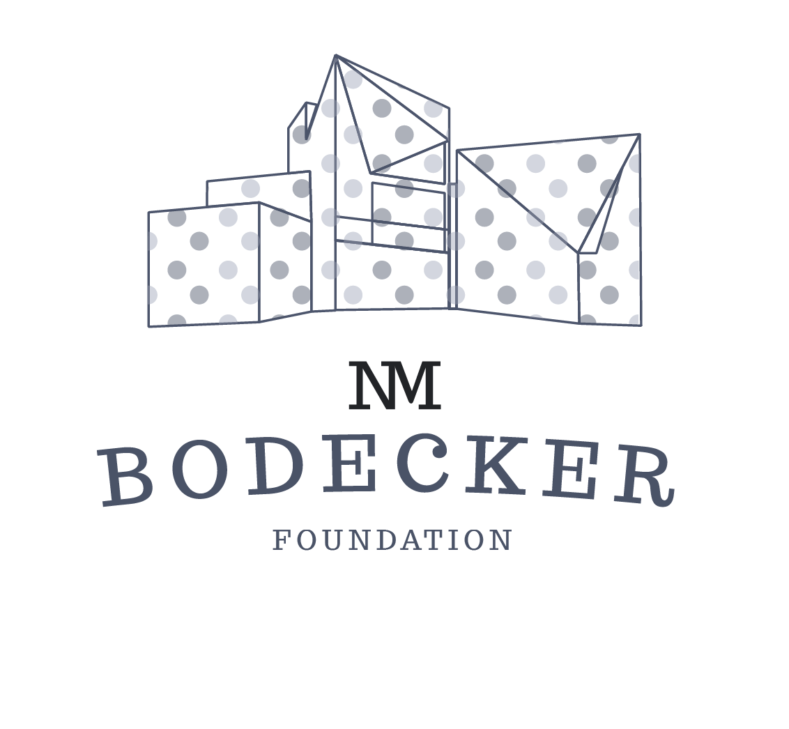
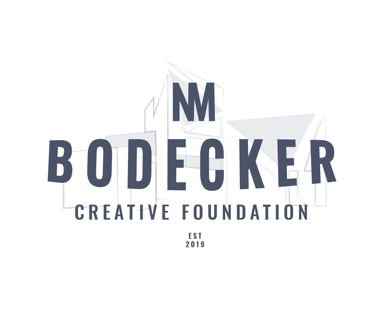
Stylize the structure as it is an amazing building that draws in the eye, and really solidifies the foundation in a physical space.
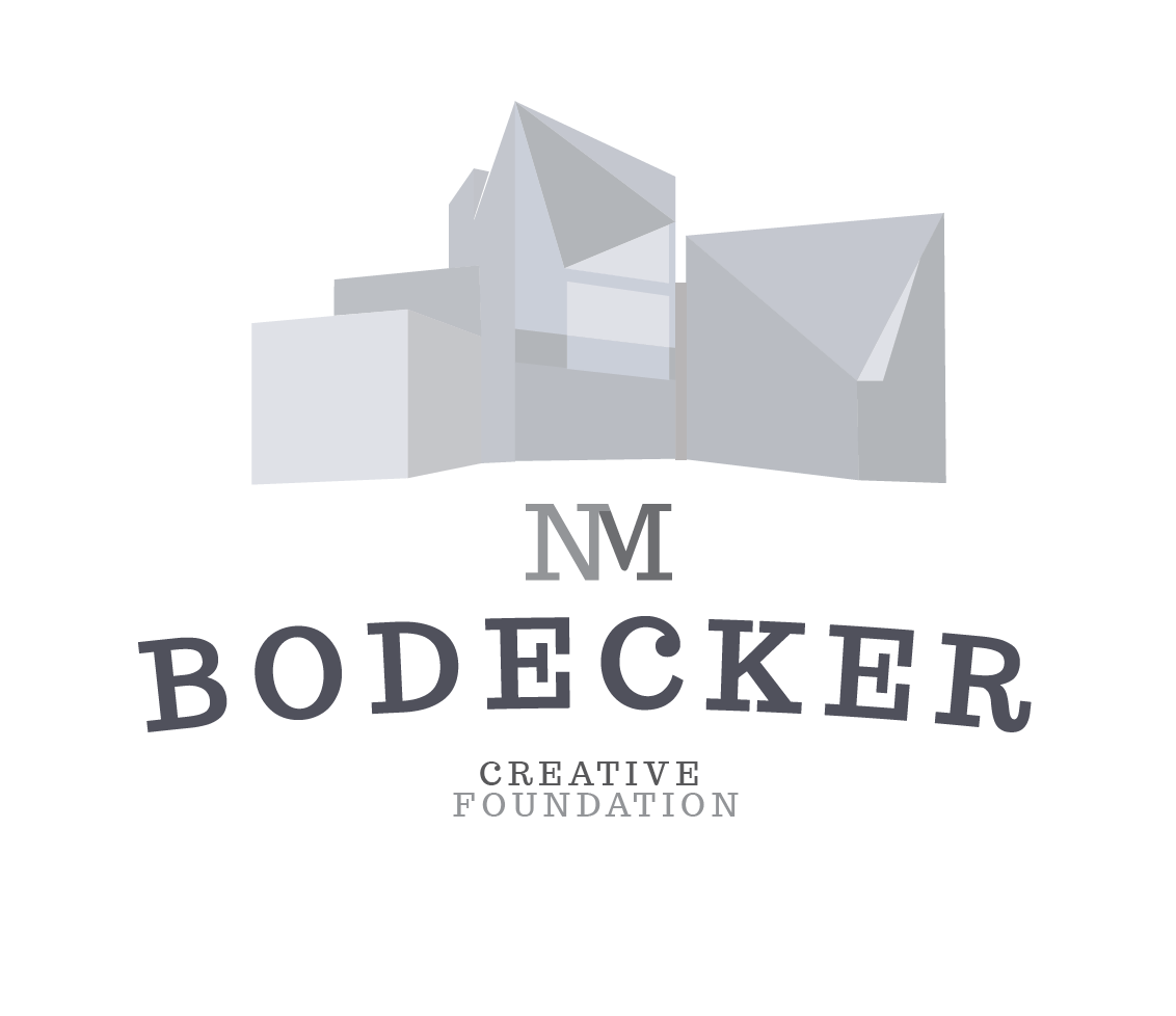
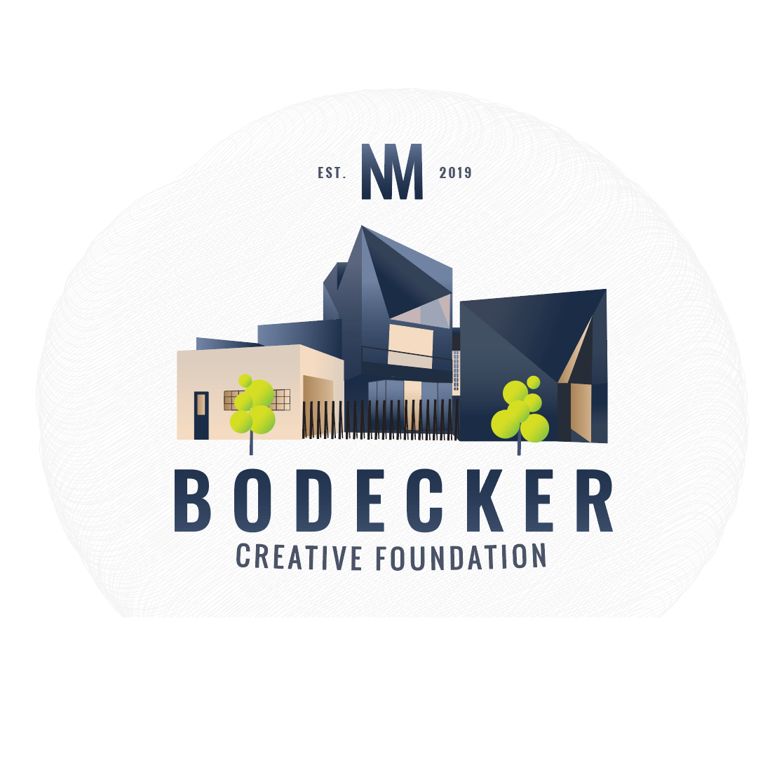

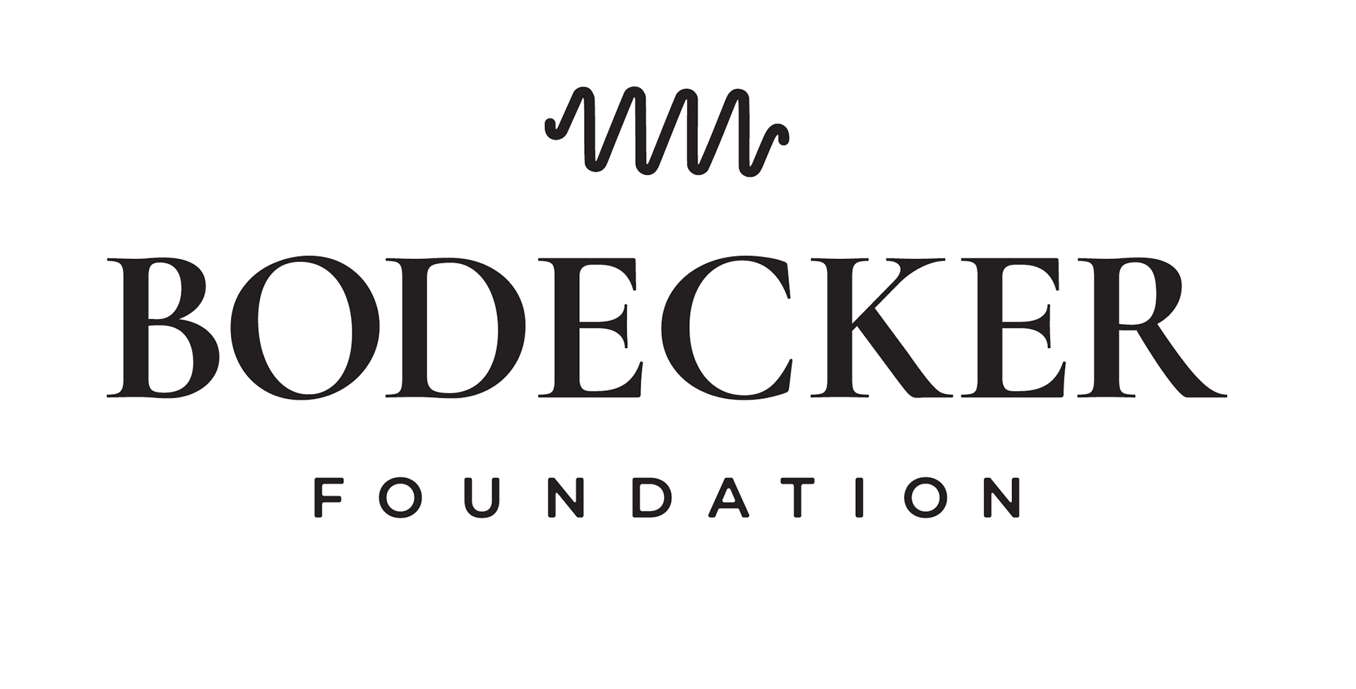
Final Result
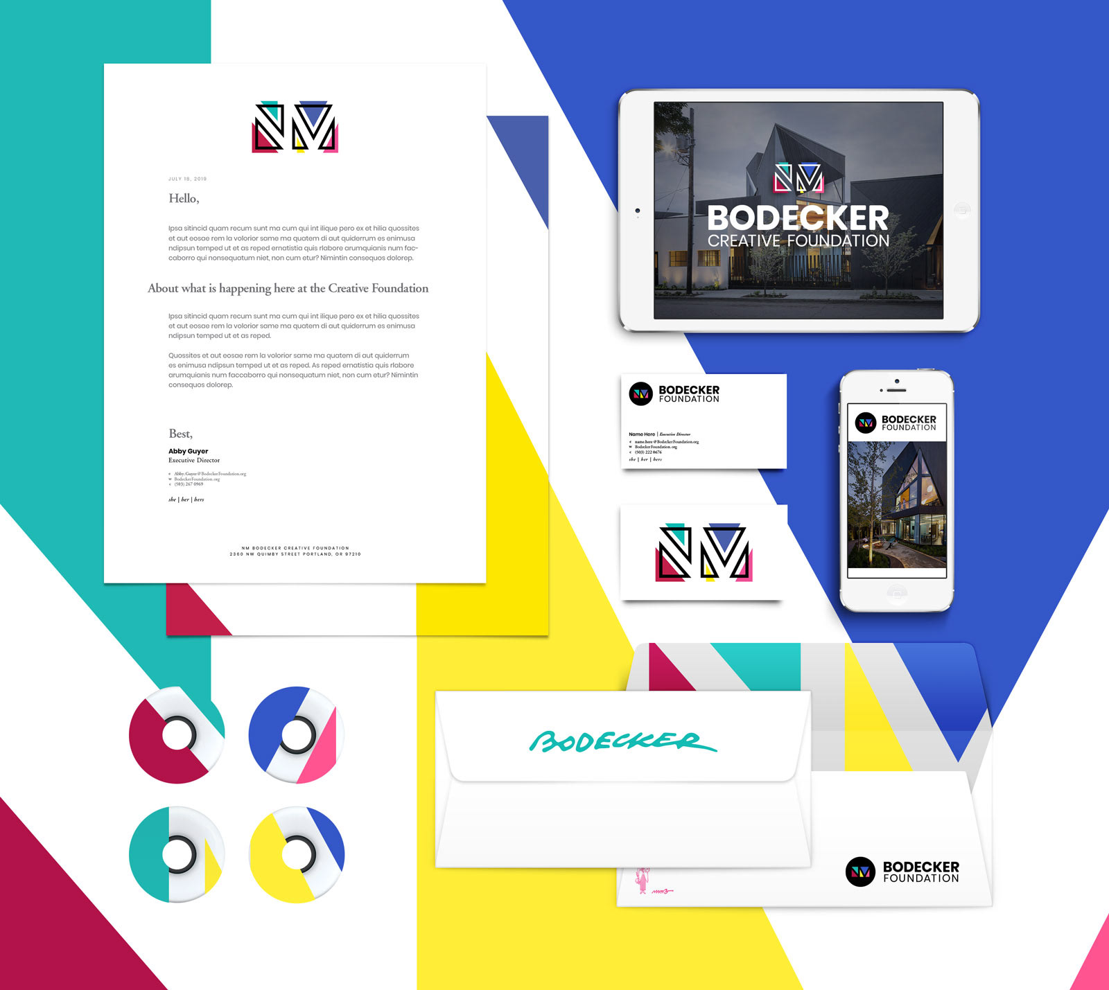
The client ultimately wanted to keep the idea of the mascot, the signature, and the monogram, but condense the idea of the structure into the mark in a more subtle way. The solution was to use the angular peaks of the architecture to create negative space outlining the NM and adding color blocking behind the mark to celebrate Sandy's colorful disposition.
The Mascot and signature were kept in the branding package, but only to be used as embellishment for the core branding until the mark is more established in the community and at some point can be used in stand-alone executions.