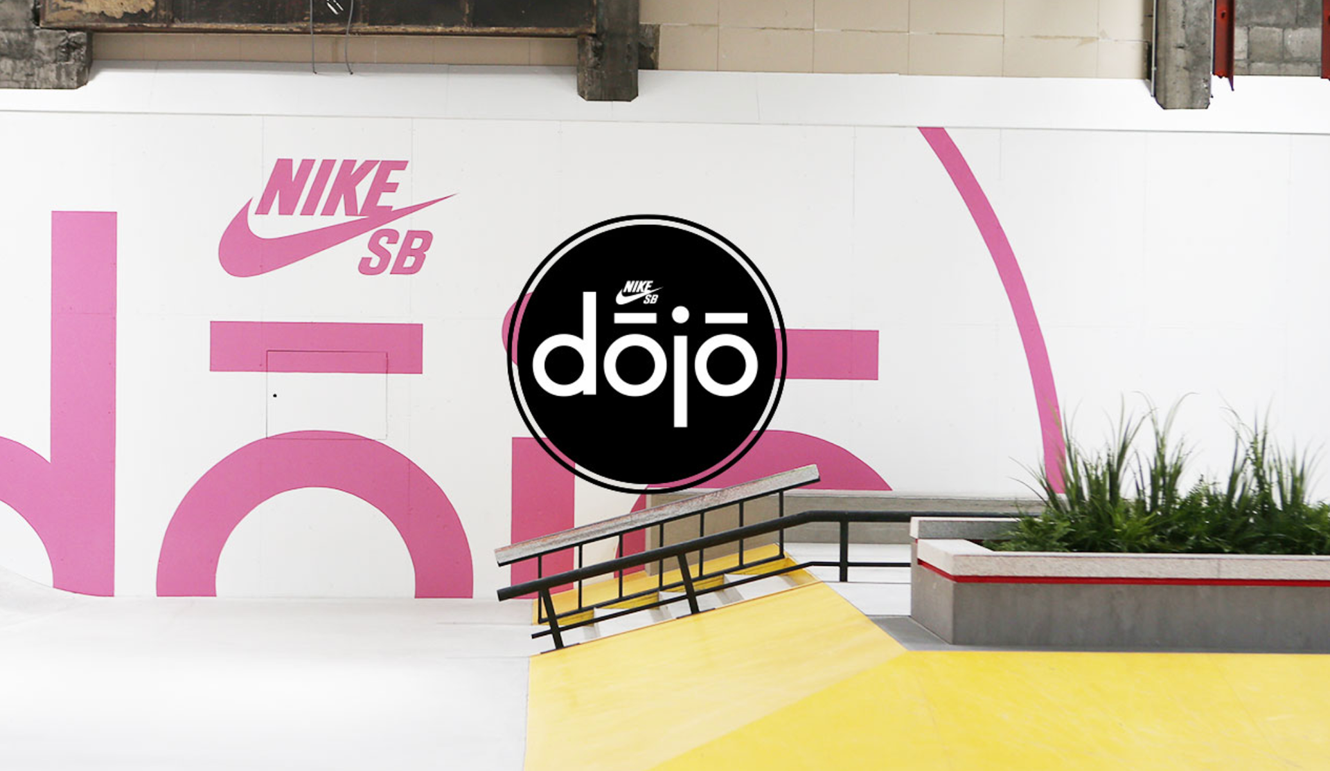
Nike SB
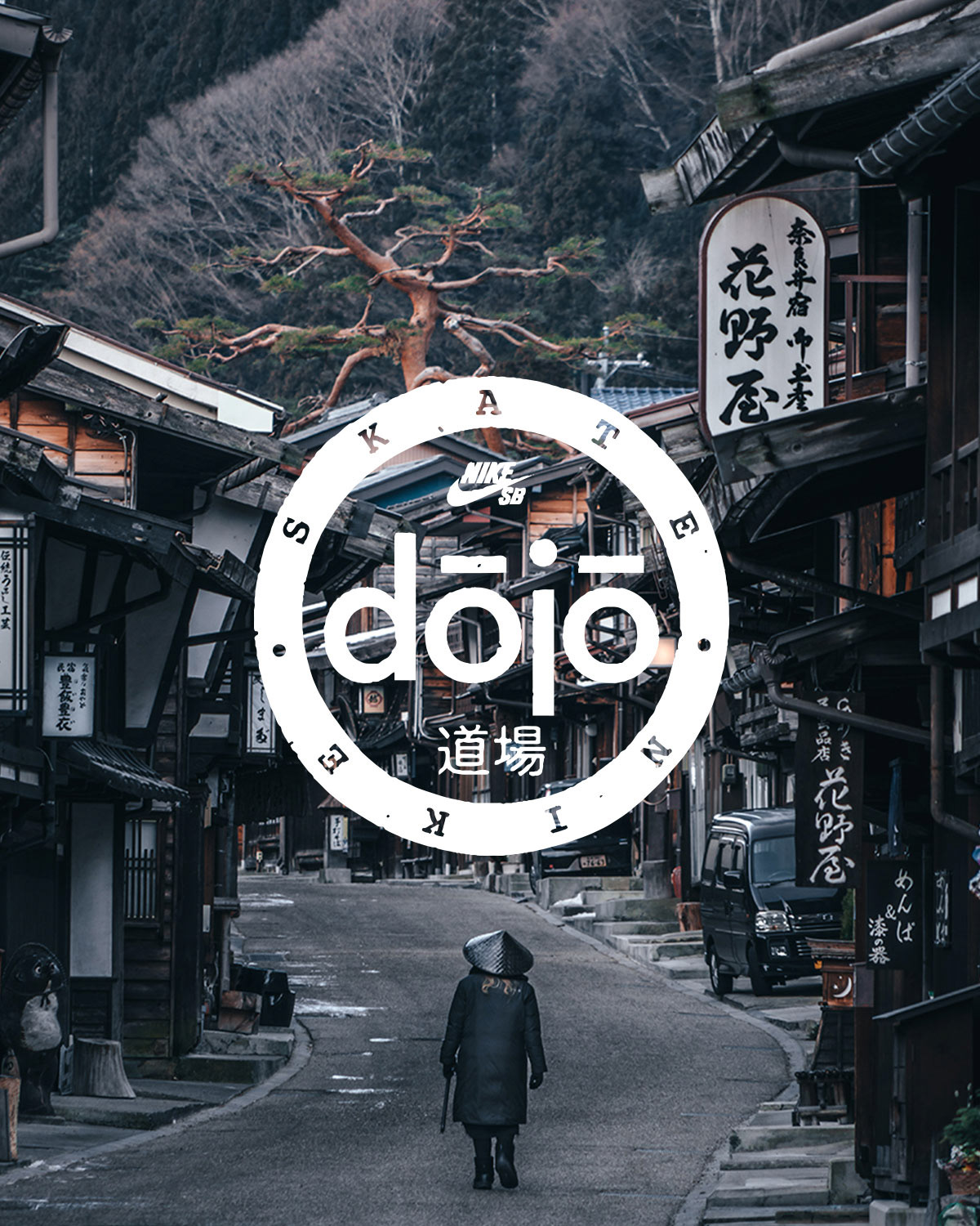
Dojo Skate Park Branding
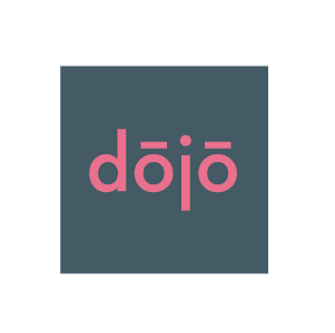
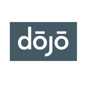
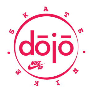
My initial project with the Nike Skateboard team centered on refining the branding for a skate park collaboration in Tokyo, Japan, named Dojo. The indoor park aimed to offer Japanese youth a clean and innovative space to skate and socialize while testing out the latest SB gear. We pursued a design direction that emphasized simplicity, youthfulness, and approachability, drawing inspiration from the Japanese Hanko stamp-making style. Through exploration, a distinct character emerged in the typography, ultimately shaping the final mark.
Art Direction | Hershel Baltrotsky
Design | Rory Brown
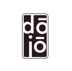
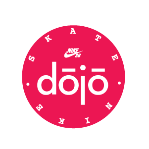
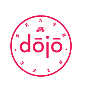
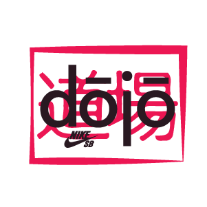
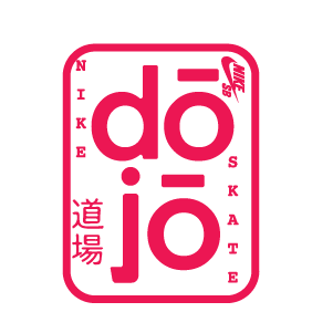
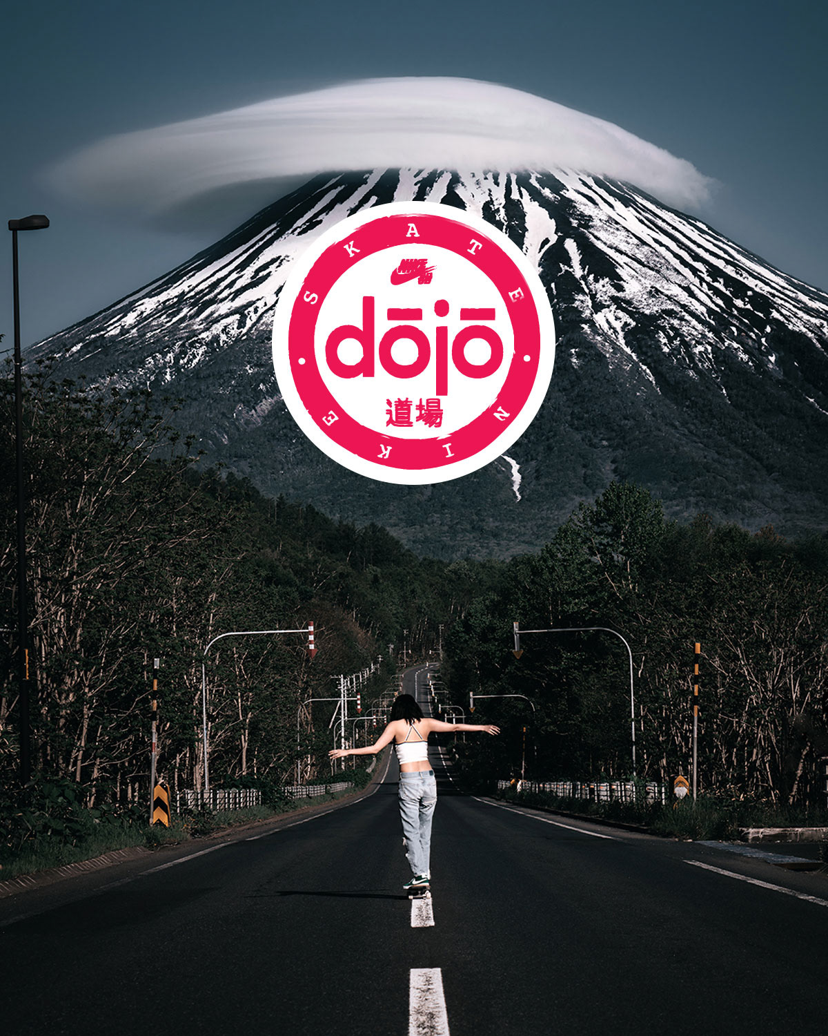
Process : Logo exploration
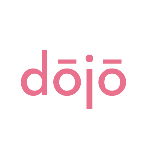
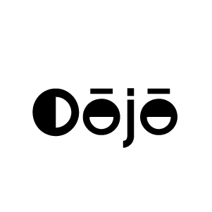
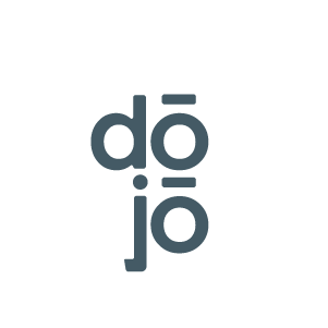
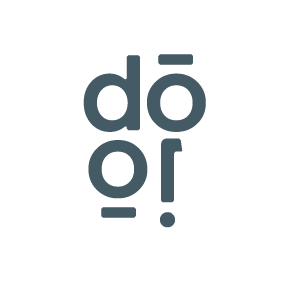
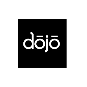
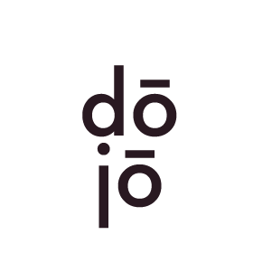
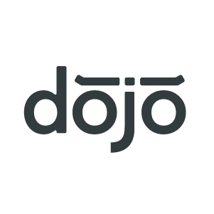
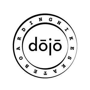
This is where they wanted to explore the mark in a Hanko style which is a traditional Japanese stamp technique, but with a modern Nike SB take.
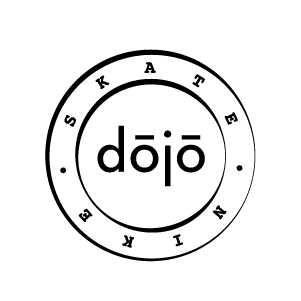
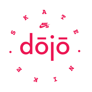
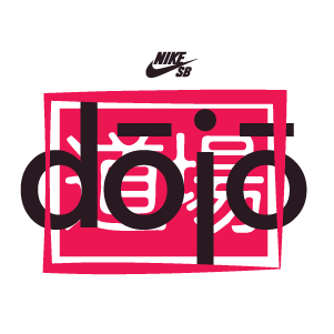
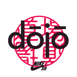
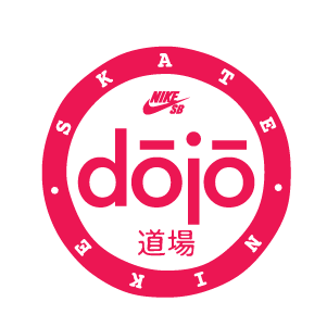
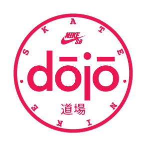
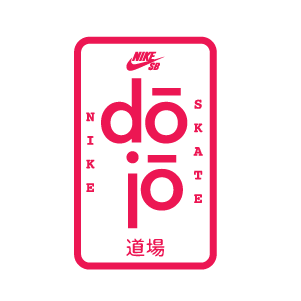
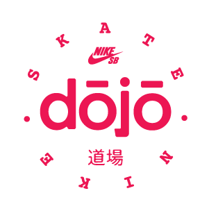
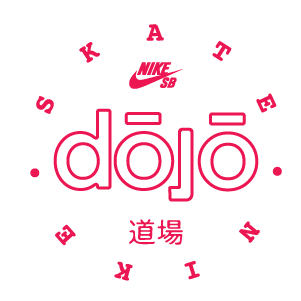
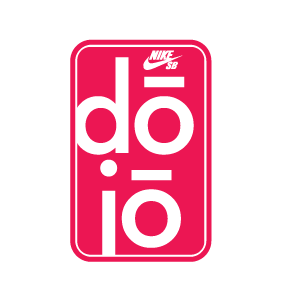
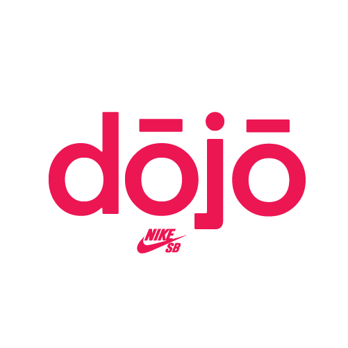
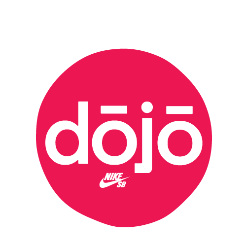
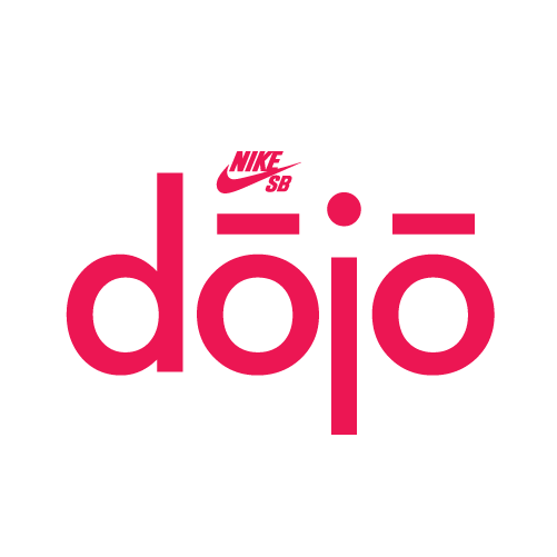
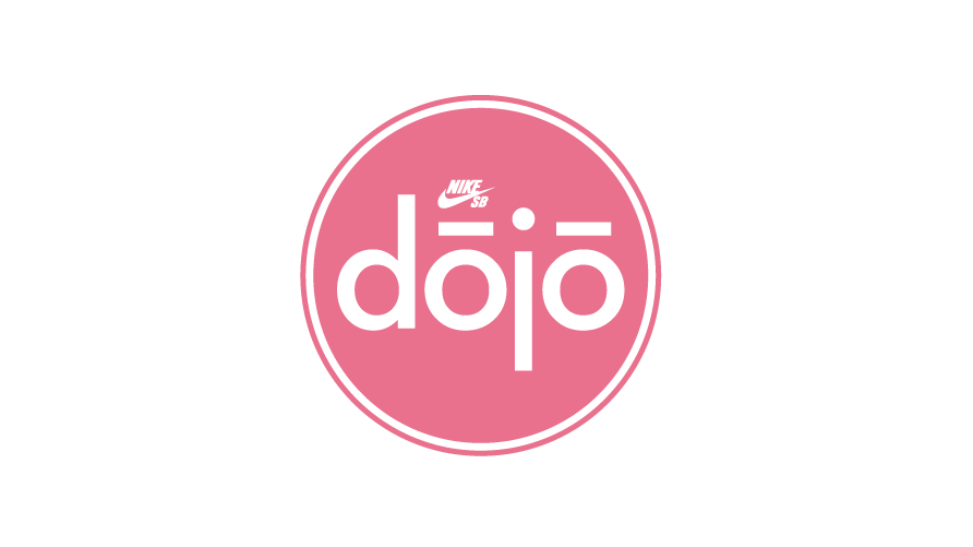
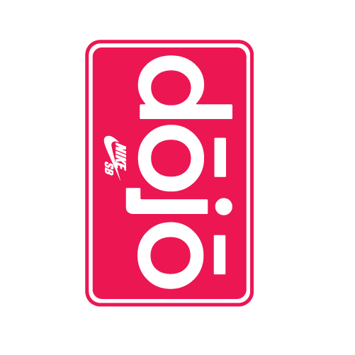
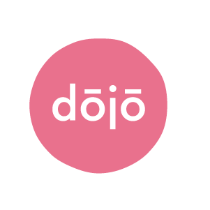
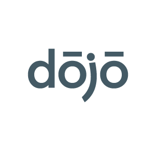
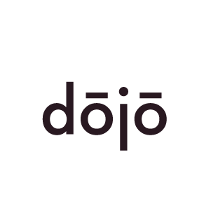
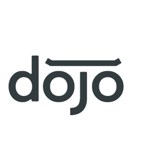
Comps in the process
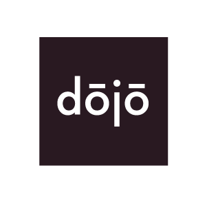
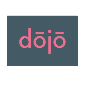
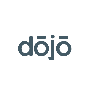
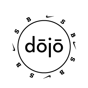
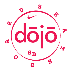
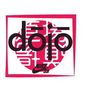
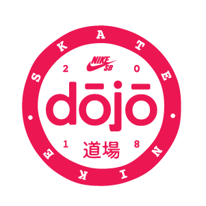
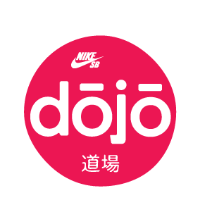
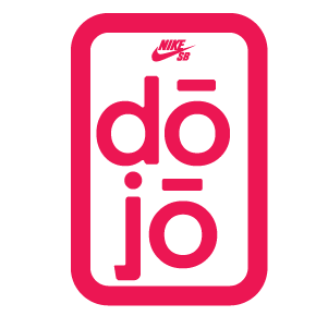
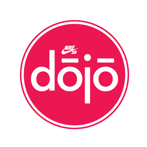
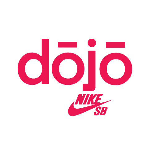
Finished badge uesd in the skate park.